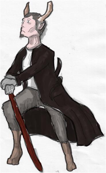
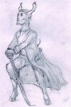
So IŌĆÖve been playing with some new techniques and some new equipment. The above image is the first colour image IŌĆÖve done in a while and it was coloured very quick. I used a ŌĆ£lightboxŌĆØ to trace the original pencil sketch (which you can see below), then used a selection of toned coptic markers to give it shadow and depth. And finally, using gimpŌĆÖs hand-drawn selection and ŌĆ£colorifyŌĆØ┬ĀI was able to colour it in less than 30 minutes. IŌĆÖm not sure IŌĆÖm going to continue the image first, it was more for a test of techniques and equipment but I certainly like it. There are lots of little computer tricks I could have applied and I really didnŌĆÖt go into depth in my choice of colours.
I bought a really cheap lightbox, it says itŌĆÖs A4 but it barely handles a full page. However a big proper one costs 50 euros or more, depending on brand, so IŌĆÖd rather try a cheap one first to see if IŌĆÖd use it before investing in a decent one. ItŌĆÖs just a bright light under a white perspex box and it allows me to place the original drawing on top and using the light I can trace it onto another page. I use to scan the image in and then print it out, which was laborious and time-consuming. This method I allows me to play with the original image while I copy it, improving and enhancing it. It also allows me more freedom when I sketch, I donŌĆÖt have to worry about getting rid of the construction lines (which can be actually helpful for tracing).
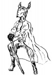
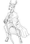
I also bought a new set of watercolour paints and plan to try them next. I did have a set of watercolours, but I havenŌĆÖt used them in years and they had all dried. When I was much younger, watercolours were my particular favourite type of paint though I never really mastered them. I also played with pens versus brushes. You can see the pen work versus brush on the same Satyr. My wife likes the brush one, but I feel I have a lot to master with the brush, but I think long term itŌĆÖll produce much better effects. I did try a bigger image:
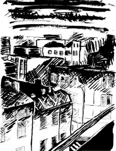
In the thumbnail version it looks okay, but IŌĆÖm not particularly happy with the end result. I should have gone for deeper blacks and less tried to capture tone with shading. I think the original pencil┬Āversion is better but doesnŌĆÖt translate to computer well.

[ŌĆ”] You can read more about this particular one on my personal blog. // [ŌĆ”]
This is really good work! I like the ink/brush work the best. Have you tried combining some of these mediums? Particularly, the coptic markers - they seem good for background, while ink/brush could be used for characters.
Thank you very much!
The coptic markers are great when you plan to colour on the computer. It allows you such freedom to choose colours and play with it. My only difficulty is that IŌĆÖm still using a mouse, so when IŌĆÖm selecting regions itŌĆÖs a bit dodgy, but it does produce great results. Check out this piece I did quickly recently (the heads and hands are a bit off but the colours really bring it out).
I have been playing with mixing mediums, a bit. Check out my latest work here, mixing markers, brush and pen. Though I donŌĆÖt plan to colour them.