Unfortunantly I haven’t been able to write much these few weeks. The main reason is our desktop PC at home is waiting to be repaired and my laptop has become the only computer left in our house - so to keep myself and my wife sane, we’re sharing it in the evening. This forced me off the sofa and digging into my art stuff again.
(Hopefully this post comes out alright on LJ, I can never be quite certain how my WordPress posts translate to LiveJournal style anymore)

Demon Icon
")
Olympians Icon #3 (Colour)
")
Olympians Icon #2 (Black Background)

Olympians Icon
The second image I’ve only barely finished. This again was intended to be part of my Lost Heroes RPG project. It’s meant to represent the Olympian and associated Gods. I did quite a variety of designs, finally settling this one. But I’m still not completely happy with it. In fact I did two further varianets of it, which you can see below. The first one I wanted to highlight the rose more so I used solid black for the background and tried to add texture with some hatching lines. The second one, I used colour to highlight the rose, a big departure from the previous icons I’ve done. I’d rather keep to the black and white motif (easier to print) but the colour would does look quite nice. Perhaps I should play around with using greys as well as black?
(More new art and a poll after the “link”)
Which of these flavours of the "Olympian Icon" image is better?
- Olympian Icon (100%, 1 Votes)
- Olympians Icon #2 (Black Background) (0%, 0 Votes)
- Olympians Icon #3 (Colour) (0%, 0 Votes)
Total Voters: 1
Part of the reason I enjoy doing these icons is that it helps focus my mind on the next section of writing for Lost Heroes. It drags me into it, into thinking about what is important to represent in that section. Strangely most of my work these days is focused around Lost Heroes, even that which isn’t directly intended to be part of the project. For example, despite losing some of the access to my place to write, I did manage to complete this very short story: Laura and the Stalker with the Golden Blade. While it stands alone as a piece of fiction, it is embedded very much in the mythos and setting of Lost Heroes displaying many of the themes I want to put into the project.

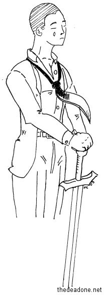 So when I started just drawing for the sake of it, I came up with this on the right. Again the iconography and themes of the art is all Lost Heroes. I like the composition of the piece though I think it might have worked a lot better using ink instead of pencil/charcoal. Though charcoal is fun to use, dirty and messy and getting your hands into the piece. This piece on the right shows a much earlier incarnation of the same idea. I don’t know if I have “improved” since then, but I do enjoy more.
 I also did one final image. It was sorta rushed but I did it on the wave of the previous piece. It’s a scene I keep imagining in my head (again, based off Lost Heroes). This rendering doesn’t do it justice, but the composition and layout of elements is there. Again done with the messy pencil and charcoal, though I think it would really work with striking black and greys.