When I uploaded the photos from my five-year-old daughter’s digital camera, I found some shots that managed to capture unexpected looks and expressions on people. I was so taken by at least one I decided to work up an image.
I was also partly inspired by the character “Meave” that I created in my mind for this little piece of fiction for my Lost Heroes RPG project. Here’s the relevant two paragraphs:
The young emo-goth Meave sits by herself in the school cafeteria. She numbly rubs at the healed scars on her wrists. The other kids just ignore her today. This is a good day for her. …
Meave will see her father, the god Dagda, in the distance watching her. She will run from him, run as hard as a princess of worlds that don’t exist can run. And the crows will screech through the sky after her.
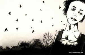
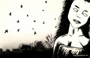
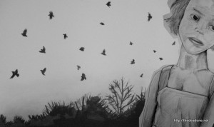
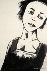
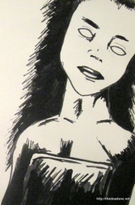
During the process I ended up branching and producing a second more creepy character (which I’ve been referring to as “deadeyes”). Anyway, here are the two completed images:
(Which one works best do you think?)
The one thing I’m learning in any of my creative endeavours; writing, drawing and even programming, is that you learn so much by working through the process from beginning to end and it greatly improves the basic fundamental skills. And the stuff I did during the process, I think, is nearly as good as the end result.
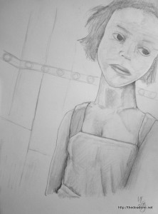
I’ve been tinkering a lot with my drawing process. For a start I didn’t use a scanner. Instead I photographed them with a digital camera and use the photos. This preserves the textures and tones much better than using a scanner. You can see this in the original pencil drawing here.
But there is a catch which I’ve noticed. The shape of the lens of the camera “bends” the drawing. It’s not perfectly to shape, there is a slight distortion. But I think it pays off in terms of the quality of the image.
It was the expression that really captured my imagination and those big lips. I’ve been told I got a good likeness of the person in the photo, however I’m not going to be uploading it here so you’ll just have to take my word for it.
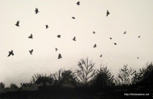
I already had the end image composition in my mind, but I needed a good background. I grabbed several reference images from my photo collection and developed this of a murder of crows. The image is good enough stand-alone I think.
I had originally intended this to be a silhouette only, pure black. I used ink with brushes and black markers and I ended up giving it some texture, which really worked. Then, for good measure, I used charcoal to give it that rising tint you get at twilight. Again I photographed it to keep the texture (it was also on an A3 page so my A4 scanner is too small). And once I had the images on the computer I could start playing around with composition:
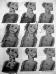
I then printed out a series of the character study to see how I could “enhance” it:
(You can see where I came up with the dead-eyes concept)
My first stab at moving the sketch to ink was atrocious (and I’m not uploading it here!). So I pass the sketch through some filters on the computer and got out a raw black and white version and I used this as the basis of the first run. I thought it looked cool, though I think part of the expression got lost (but the ratio of the head to body seemed to improve, or had you not noticed that it was off?).
Having everything set up, I just ran with it and dug up the second character visualisation:
Initially I thought it came out better, but looking at the final two pieces, it was simply different but just as good.
Once all the pieces were in place, it was just a matter of getting them into the computer and arranging them in some image editor. I did play around with a lot of the funky effects you can do in software, but I felt they didn’t add to the final image. I think such effects work better if you’re colouring the images.
Both images work, though they each have a different feel. Certainly the “deadeyes” one is more creepy, but the first is closer to my original vision. I learned lots doing this one, and I have a few other projects/ideas I want to do. I may even use this image in Lost Heroes RPG: Book of Gods, you’ll just have to wait and see. ![]()
