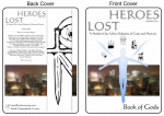
I also had the title “An Adventures in Graphic design and Typography!” in my mind when I started putting together this post, but I think that might be a bit melodramatic. If you’re following me on twitter, you’d have seen this image before, but for those that don’t, what do you think? Does it look like an RPG you’d play?

Lost Heroes RPG: Front and Back Covers
Don’t mind the text on the back cover. It’s just a space filler for when I really write something.
I took a short break from working on Lost Heroes RPG and end up working on Lost Heroes RPG! Swinging from writing to graphics and layout. I just started playing around with ideas on paper for the front cover of Lost Heroes as a book and ended up taking it to the end.
I don’t think my efforts are professional, but they look good, good enough to fool you from a distance! ![]() I’m working with my “limits” here, using what I can do well, to produce something that looks good. The above image was generated using Inkscape, Gimp and original artwork by myself. The little icons I’ve been working on all along (just check out the “drawings” tag to see more about them).
I’m working with my “limits” here, using what I can do well, to produce something that looks good. The above image was generated using Inkscape, Gimp and original artwork by myself. The little icons I’ve been working on all along (just check out the “drawings” tag to see more about them).
I have to say, I’m loving Inkscape as a tool more and more. I can easily move around and edit elements of the above image. And the images are all scalar vector graphics scalable vector graphics so I can print them out at any resolution and they look good. I’m not sure how they’ll fit into a Desktop Publishing Tool when I finally start to think about layout of the PDFs later for Lost Heroes.
- Lost Heroes RPG: Front and Back Covers
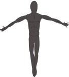
- Working with the Figure on Computer
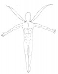
- Final Ink of Figure
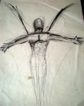
- Fleshing it out #2 (pencil and ink)
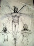
- Fleshing it out (pencil)
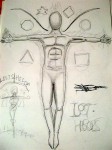
- Inital Concept (pencil)
Here you can see the process in a little more detail. I used pencil, ink and charcoal while playing around with it. My original idea was the abstract “angel” with the floating symbols and a rope tided around his legs pulling him back down to a graphic-inspired city scape. I imagined the logo for Lost Heroes sort of exploding from the top of the image.
I’m not particularly happy with the Lost Heroes logo. It works but its static and a little boring. Doing a little search on “typography” found me getting quite inspired, realising that the text is as much part of the picture composition as anything else. Playing around with it, I wasn’t getting convincing or pleasing results though. I ended up just laying it out and modifying the other elements to work with it.
[…] (read about the construction of this image on my personal blog!) […]
Have to say, I don’t like the layout of the title at all. It wasn’t until I got to the bottom of your post that I realised the title’s Lost Heroes and not Heroes Lost.
Since ‘western’ text reads left to right, top to bottom, your title leaves a new reader guessing as to how it’s meant to be read. Since it’s usual to see multi-line text where the first line is indented, I read it Heroes Lost. But even if I had interpreted the title properly, I find it an annoying layout.
You can easily resize the text to fit on one line, or lay it out properly — ‘Heroes’ top-left-justified, ‘Lost’ bottom right-justitified*. I assume you’re trying to make the title ‘different’ to stand out, but personally don’t think the way you have it right now is the way to do it. If it worked, plenty of other publishers would already be doing it.
*Edit: Thankfully proofread before posting for once. There I go again. See, I have the title wrong in my head now. That should read: ‘Lost’ top-left-justified, ‘Heroes’ bottom right-justitified.
SVG stands for “Scalable Vector Graphics”, not “Scalar Vector Graphics”
Thank you. Post updated.
Thanks for you’re feedback Zensun. I’ll keep you’re feedback in mind when I revise the layout next (still focusing on content before doing really launching into layout and presentation).