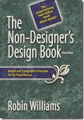
I read lots on my holidays, as you do. But the best book I read over my holidays┬Ā was actually a non-fiction book: A Non DesignerŌĆÖs Design Book.
 IŌĆÖve had this book ages. I read the first half of it a long time back, realised it made a lot of sense and then stopped reading because I wanted to assimilate the lessons. Which seemed to really only half-worked, as I never put them into practice. Then on holidays I decided to read it all the way through, re-affirming what I had remembered. But it wasnŌĆÖt until I read the final chapter on type that it really opened my eyes. My god have I been screwing up layouts for years and couldnŌĆÖt understand why.
IŌĆÖve always struggle with layout to the point where IŌĆÖve kinda turned off writing games in public. Seriously, no matter how good your idea or game is, and even if itŌĆÖs free, if you canŌĆÖt present it in a nice package, no-one will read it. It was like a creative block. Even though I can draw and I consider myself somewhat artistic, layout just eluded me.
While this book isnŌĆÖt going to convert me into a super-nifty master of DTP and web design, at least now I can understand why my layouts suck and that means I can actually do it better or at least not so shit. As soon as I finished the book I started mucking around and re-did the logo for my Lost Heroes RPG project (the attached image) just using the fonts I had on my laptop, within a few hours. I much prefer this logo to the one I spend a feckŌĆÖin age doing. ItŌĆÖs making my layout choices deliberate rather than just guessing/instinct.

My original/previous logo for Lost Heroes RPG
ItŌĆÖs inspired me to try and do stuff again. IŌĆÖve installed Scribus and itŌĆÖs not so overwhelming to me any more. This book gets a +1 from me. ![]()
(Originally posted on G+ 31/7/12)

[ŌĆ”] my personal blog, I wrote briefly about some creative stuff from my holidays. But more importantly I started to re-design the Lost Heroes logo (and explained [ŌĆ”]